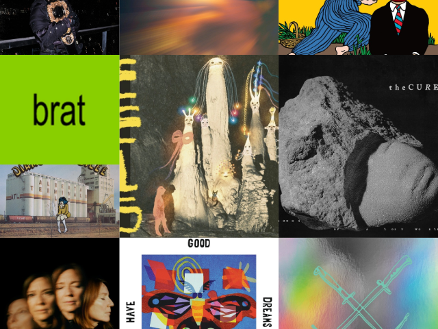
If you’re an upcoming music artist who’s getting prepared to release an album on Spotify, one thing you will want to consider is the album cover. Before any listeners hear the music you have recorded, they will see this image. While an album cover won’t be the deciding factor for a person to choose to listen to the music, it will create an image that they could remember forever. On Spotistar you can boost your Spotify plays and followers up.
Every music lover can think of at least two or three album covers that they consider iconic. Almost everyone is familiar with the album cover to Pink Floyd’s Dark Side of the Moon, even if they have never heard a track from that album before. The simple prism with a black background is imprinted in minds around the world.
This is one of many reasons that you should put some extra thought into finding the perfect album cover for your Spotify album. On this page, we’re going to breakdown what you need to know about getting your album cover right.
Get the sizing right for your Spotify album cover
Before we get into the creative aspects, it’s important that you get the sizing correct. If the image size is off, it will appear distorted on people’s device and it won’t have the same effect you were hoping for.
Keep in mind, the majority of your listeners will be seeing this album cover as a one inch image. Knowing that ahead of time can help you plan out the right design.
For a Spotify album, your image needs to be a perfect square, which means you will need to ensure the image has an aspect ratio of 1:1. The ideal size to work with is 640 pixels by 640 pixels and the image should not exceed 4 MB. Another thing to know about Spotify is that the platform only allows images that are JPG, PGN, or TIFF.
Get the image right for your Spotify album cover
Now that you know what sizing, let’s cover some things you should know about getting the image right. Of course, the image should first and foremost be a representation of your music and vision. It should also be something that will appeal to your target audience.
Since it will likely be viewed in a small thumbnail first, the image needs to be something that will be just as good as it does when it’s enlarged. This is why many artists find more success in going for a minimalist design. It’s important to add text to your album cover, so a minimalist design will help keep everything balanced.
One tip that has helped a lot of artists who were struggling with their design is to think of the mood or vibe that they want the album to create. Now, match that feeling to a color. The color that matches your album’s vibe is a great starting point to coming up with the right design for your Spotify album.


